Judging Websites by Their Cover: The Homepage in Web Design
BY ITW Consulting
Web Design and Development
Like the front door to a home, the homepage of a website greets visitors while providing an idea of what they can expect to find inside. But just as with a home, making a strong first impression in web design should never happen at the expense of the interior, the place where interactions and a deeper level of engagement are supposed to happen.

Although the homepage is critical to a site’s effectiveness, many website design companies devote so much time and effort to this single page that they end up with a product that underwhelms the deeper you delve into the site. Imagine, all that effort and a visitor may never even see the homepage—depending on which terms they used in their search, they could land on a dud of a page crammed somewhere way in the back.
Still, in web design, home is where the heart is. Consider these characteristics of a highly effective homepage:
- Introduce the “Who” and the “What”
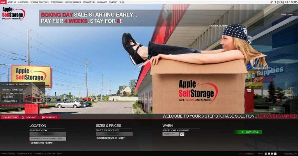
- Spell out plainly what users can do on the site and guide them toward those actions
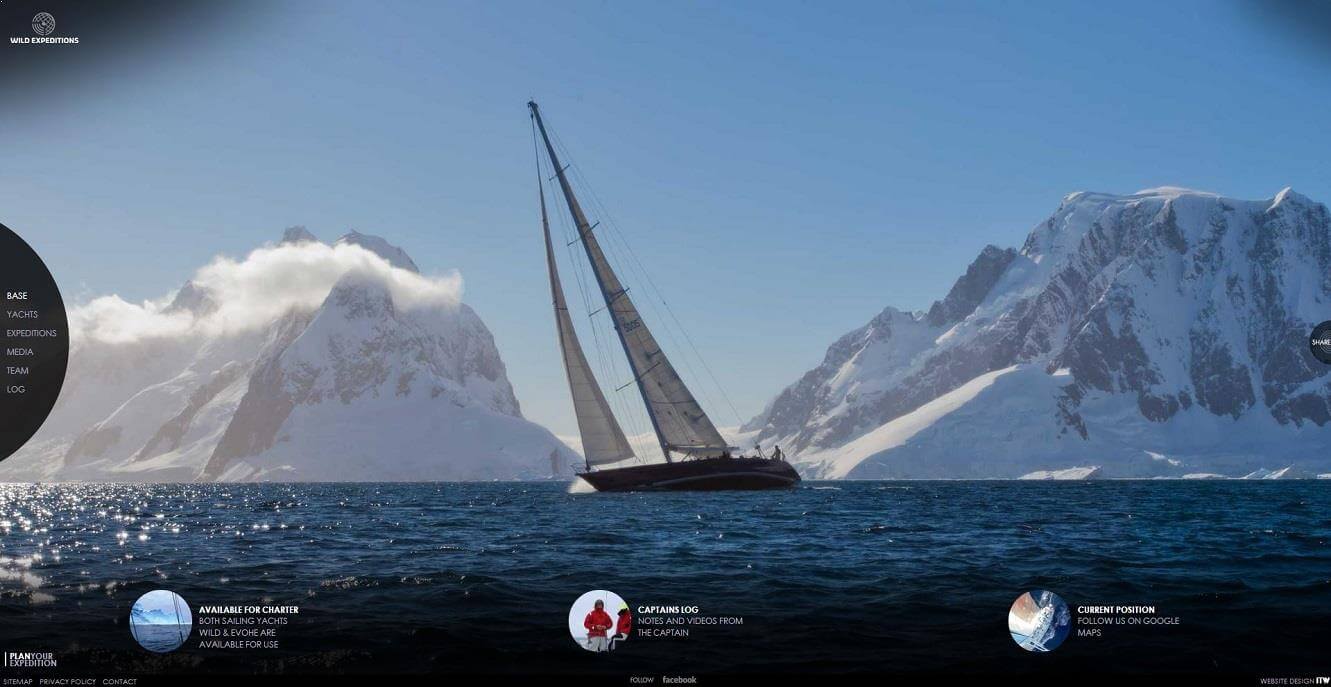
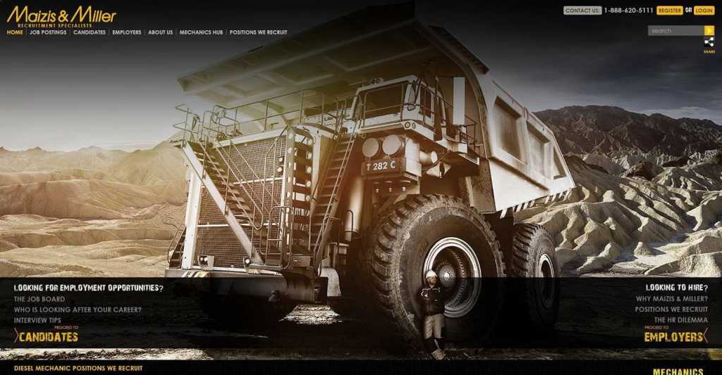
- Establish the creative character of the entire site and captivate visitors instantly through a strong visual presentation
- Speak directly to the target market using relevant visuals and messaging
- Present a distinctive look and feel that will strengthen branding efforts
- Encourages visitors to step inside and explore
- Load quickly to avoid user frustration or create a bad impression

It’s no longer enough to wow users with an amazing visual presentation. Great web design also accounts for usability and ROI, especially in the case of an ecommerce website. The homepage should serve as a springboard for the rest of the site, making it as easy as possible for users to find their way. If the first thing people see is purely superficial, you’ve got a nice piece of artwork, not a lead-generation tool or an information hub. And although the site’s purpose will impact its homepage design, the most effective and enduring websites all share a remarkable number of similarities.
Form and function, together at last
With the trend toward more user-friendly web design—in other words, sites that tone it down and deliver a smooth user experience—graphic designers are becoming increasingly tuned in to the good of the site as a whole; sure, it’s got to look great, but not if function suffers as a result of a design choice. Today, website design companies have to balance artistic drive with entrepreneurial spirit if their sites are going to make a lasting impact, and it all starts with the homepage.
Chalk it up to diminishing attention spans or increasing demands on time, but audiences just don’t stay captivated the way they used to. Your window of opportunity isn’t large enough to account for investigative work on the part of the user. Covers matter, and judgements come swiftly.
Saying more with less
Engaging web design usually features an emphasis on visuals over text, with the latter relegated to a supporting role unless it’s a news-rich website. The homepage in particular serves up big, bold imagery and stylized text, with only as much copy as is necessary to get the point across—not unlike a magazine ad.
Ecommerce websites should lay out a limited selection of products to whet the user’s appetite and entice further exploration. When products are familiar—a T-shirt, a book, a vacation—the homepage should immediately funnel users to a section where they can make a purchase. But when products are less familiar, an introductory video or a secondary call to action right on the homepage can be valuable in establishing a connection with the user. Asking visitors to make a purchase before they’re fully comfortable with the product is a setup for failure.
Sites that advertise a service or a product that is difficult to represent visually face a tougher challenge. Here, website design companies and graphic designers may struggle to deliver a strong homepage presentation, especially if they’re forced to rely on stock imagery. Text can step up and help fill the void if used effectively and with a distinguishing style. But few messages are powerful or distinct enough to do the heavy lifting. Good web design finds a way to add artistic flare to the homepage, even if the imagery isn’t breathtaking.

Homepage 3.0
Thanks to the advanced capabilities offered by HTML5, web design companies can incorporate a background video right on the homepage without overloading devices or draining data. Used tastefully, this feature can definitely help a website stand out from the crowd. The key, as with any visual, is not to overwhelm the visitor or crowd out the website’s navigation. The graphic designer should also make sure that a plan B is in place for devices or browsers that don’t deliver the video as well.
ITW Consulting is an award-winning web design company in Toronto, serving clients worldwide. Check out our ever-expanding portfolio to see more examples of effective homepage design and the world behind the front door.
