Good Website Design: An Ode to Straightforward Navigation
BY ITW Consulting
ITW Consulting Corp
Conformity in web design, or any creative field for that matter, is nothing to aspire to (even less so with every new site that comes online). That being said, many internet users have come to expect certain universal truths in their online experiences, including appealing visual content, social sharing capabilities and, maybe most of all, a logical navigation that makes it quick and easy to sift through all that content.

Time being at a premium these days, people have very little tolerance for anything that can waste that precious resource. Good website design is more than pretty pictures and well-conceived content: it’s part of a much larger picture that encompasses user-friendliness, interactivity, branding, informativeness and a host of other criteria. Essentially, it refers to anything that leaves visitors feeling validated for having decided to spend time exploring one website over millions of others.
Navigation, the process by which you make your way around a site or other online property, weighs heavily in the determining of whether that website features good design or bad design. The temptation might be to devise something off-the-wall and utterly unique – the kind of thing you could conceive only in an acid-induced creative romp. But above all else navigation has to be intuitive, a recognizable system that eliminates questions like “Where am I?” and replaces them with questions like “Why didn’t I come to this site before?”
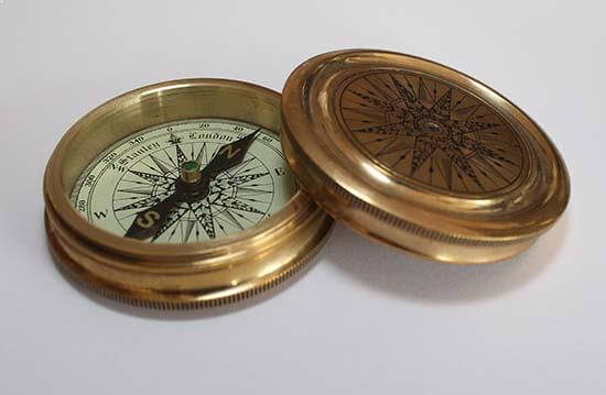
Like “Alice’s Adventures in Wonderland” but if Alice had “The Golden Compass”
Straightforward navigation doesn’t mean the site has to have a plain aesthetic. A website design company can still take inspiration from, say, Frank Gehry, the architect renowned for his surreal and unconventional designs. But at the end of the day, visitors still have to be able to find their way around without a tour guide. Although graphic designers might present the menu in a fresh, hyper-stylized manner, it should still reflect a familiar arrangement.
Menus for navigating appear most often at the top of the page, where visitors can immediately get the lay of the land after arriving at a new site. Simple menus go hand in hand with good website design because they project a high level of organization – in fact, one of the best ways to ensure a high bounce rate (which measures the amount of people who leave a website without doing anything) is to implement a cluttered menu.
Of course, the more content you have, the more difficult it becomes to organize it all. That’s why a professional website design company can be so valuable, introducing structure and logic where chaos might otherwise reign. Content architecture, including a site map, should be one of the first milestones in the web design and development process, appearing well before the more exciting phases kick in. This integral but under-appreciated step gives shape to the website, as well as the entire design project.
The menu itself also presents some important choices to be made. Do you go with a standard “About Us” page or opt for something less simplistic, such as “Our Story” or “Who We Are”? Even the best, most innovative website designs play it relatively straight when it comes to navigation (and really, how many different ways can you name an “about” page while keeping it instantly recognizable to visitors?).
Consider these points when it comes to the design of your website’s navigation scheme:
- Users should know exactly what they’ll get before clicking anything on your site (if you are going to throw a curve ball do it with stunning visuals or cool functionality rather than maze-like navigation)
- Get creative with page names if it suits your site, but be wary of venturing too far off the beaten path, especially if your website should generate leads or make sales
- Save your site’s main navigation (typically at the top or the left) for the most important elements
- Avoid bulky menus, which not only overwhelm visitors but can shift unfavourably on smaller resolutions if the site is not responsive
ITW Consulting is a professional website design and development company in Toronto, responsible for creating award-winning sites from the ground up. Every ITW project incorporates thoughtful, intuitive navigation designed to provide the simplest but most rewarding user experience possible.
